Windows 3.1: The Beautiful Disaster That Changed Everything
How Microsoft’s 1992 masterpiece proved that sometimes ugly can be revolutionary, and why Program Manager was actually genius design
Okay, real talk: Windows 3.1 was absolutely hideous.
I mean, just look at this splash screen and tell me it doesn’t look like someone threw a rainbow at a filing cabinet:
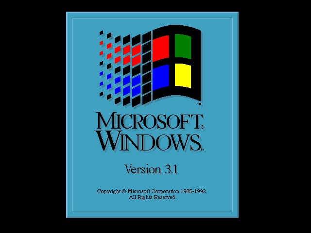 The Windows 3.1 splash screen - peak early ’90s aesthetic in all its chaotic glory
But here’s the thing that’ll blow your mind: this “ugly” interface was actually revolutionary. Windows 3.1 wasn’t just Microsoft’s first real GUI success story - it was the moment personal computing shifted from “hobby for nerds” to “thing normal humans could actually use.”
And trust me, I’ve been diving deep into these screenshots, and there’s way more genius hidden in this seemingly primitive interface than you’d ever expect.
But first, let me tell you about the day I upgraded from this “beautiful disaster” to its successor. I was SO EXCITED watching this installation screen, knowing I was about to witness the future of computing:
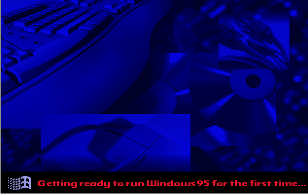 Windows 95 installation - I remember staring at this screen for what felt like hours, buzzing with anticipation for the revolution that was coming
I must have sat there for 45 minutes just watching those progress bars crawl across the screen, knowing that everything was about to change. The anticipation was incredible. This wasn’t just an upgrade - this was the moment personal computing was about to become truly personal.
But looking back now, I realize that Windows 3.1 deserves way more credit than we gave it. Sure, Windows 95 was prettier and more polished, but 3.1 laid all the groundwork.
The Program Manager: Ugly Genius in Action
Let’s start with the heart of Windows 3.1: Program Manager. Look at this thing:
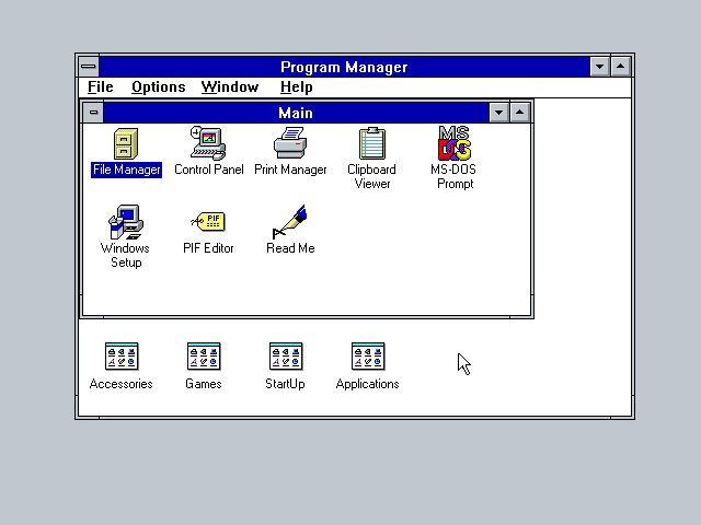 Program Manager - the desktop that wasn’t really a desktop, but somehow worked better than anything that came before
Yeah, it looks like someone organized their desktop with a label maker and zero design sense. But check out what’s actually happening here:
The Brilliant “Group” Concept
Those little windows with icons? Those aren’t just random groupings - they’re logical software categories that actually made sense to regular people:
- Main: The essential Windows stuff
- Accessories: Useful tools (Calculator, Notepad, etc.)
- Games: Because Solitaire was serious business
- Applications: Where your “real” programs lived
This was way ahead of its time. While other systems dumped everything into one giant list, Program Manager gave you visual organization that matched how people actually think about software.
No Desktop Clutter
Notice something missing? No desktop icons everywhere. The Program Manager approach meant your actual workspace (the desktop background) stayed clean, while your programs lived in organized, closeable windows.
This was brilliant! You opened Program Manager when you needed to launch something, then closed it to focus on actual work. Compare that to modern desktops covered in random shortcuts and tell me which approach makes more sense.
File Manager: The Unsung Hero of File Navigation
Before Windows Explorer, there was File Manager, and honestly? It was pretty badass:
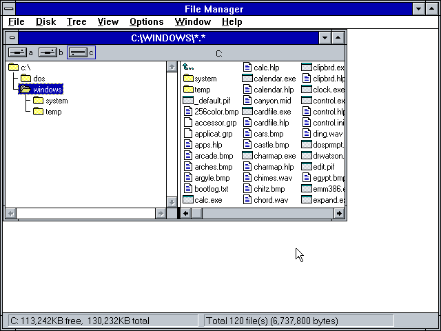 File Manager - dual-pane file browsing that power users still swear by today
Look at that dual-pane layout! This wasn’t Microsoft trying to be fancy - this was serious file management designed for people who actually needed to move stuff around. The left pane shows your directory tree, the right shows files, and you could actually see what you were doing.
Why This Was Revolutionary
- Visual directory navigation: No more typing “cd ..” endlessly
- Drag and drop: Revolutionary in 1992!
- Multiple drives: Easy switching between your floppy, hard drive, and CD-ROM
- File associations: Double-click to open - mind-blowing stuff
Modern file managers still use variations of this layout because it just works. File Manager proved that good interface design isn’t about looking pretty - it’s about helping people get stuff done efficiently.
Control Panel: Tweaking Made Accessible
Here’s where Windows 3.1 really showed its genius - making system configuration accessible to normal humans:
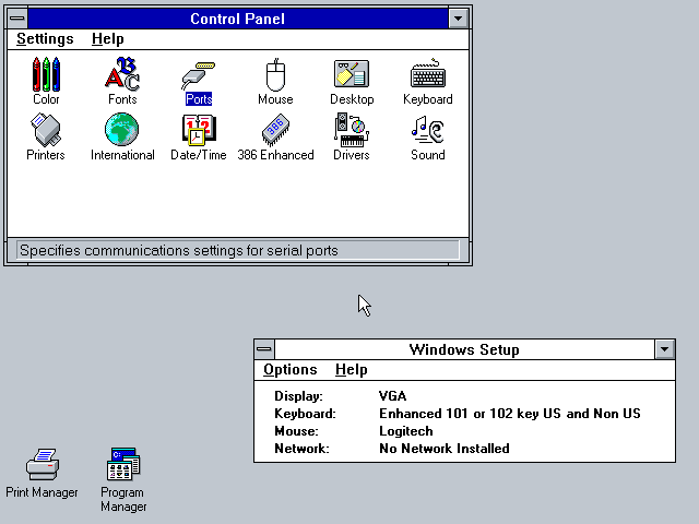 Control Panel - system configuration that didn’t require a computer science degree
Before this, changing system settings meant editing CONFIG.SYS files by hand or running arcane command-line utilities. Control Panel gave regular people actual visual controls for:
- Fonts: Install new typefaces without black magic
- Colors: Customize your interface (hello, hotdog stand color scheme!)
- Mouse: Adjust sensitivity and button behavior
- Sound: Configure system beeps and PC speaker settings
- Date/Time: Set your clock like a normal human being
The Real Innovation
This wasn’t just about making settings easier - it was about democratizing computer customization. For the first time, you didn’t need to be a programmer to make your computer feel personal.
Paintbrush: The Gateway Drug to Digital Art
And then there was Paintbrush - Microsoft’s answer to MacPaint, and honestly, it was pretty solid:
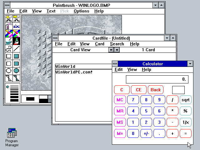 Paintbrush - where millions of people created their first digital masterpiece (usually a wonky house)
Sure, it looks primitive now, but Paintbrush was many people’s first taste of digital creativity. Those simple tools - pencil, brush, spray can, text - were enough to spark imagination and prove that computers could be creative tools, not just business machines.
The Hidden Sophistication
- Multiple brush sizes: More flexibility than you’d expect
- Pattern fills: Those weird dot patterns were actually useful
- Text integration: Type directly into your image
- Zoom functionality: Pixel-level editing capability
- Cut/copy/paste: Revolutionary workflow concepts
How many kids spent hours in Paintbrush creating pixelated masterpieces? This little program was a gateway drug to digital art for an entire generation.
My Personal Windows 3.1 Hell (And Why It Was Worth It)
Okay, confession time: I lived through this era, and let me tell you - getting Windows 3.1 to actually work was an exercise in pure masochism.
Picture this: I’m running a 286 with a monochrome Hercules monitor. Windows 3.1 needed CGA graphics minimum. So what did I do? I ran a CGA emulator just to trick Windows into thinking my graphics card was good enough.
The performance was… let’s call it “contemplative.” But it WORKED! Suddenly I had:
Real Multitasking (Sort Of)
This was the big deal nobody talks about enough. Before Windows 3.1, if you wanted to run multiple programs, you were switching between them manually or running TSR (Terminate and Stay Resident) programs that ate your precious 640KB of conventional memory.
Windows 3.1 gave you cooperative multitasking. Sure, if one program hung, it could take down the whole system. But when it worked? Mind-blowing. I could have a text editor open, File Manager running, AND Calculator available - all at the same time!
The CONFIG.SYS and AUTOEXEC.BAT Nightmare
Getting Windows 3.1 to run properly meant becoming a memory management wizard. You’d spend hours editing these files:
CONFIG.SYS:
DEVICE=C:\DOS\HIMEM.SYS
DEVICE=C:\DOS\EMM386.EXE RAM
DOS=HIGH,UMB
FILES=40
BUFFERS=20
AUTOEXEC.BAT:
@ECHO OFF
PROMPT $p$g
PATH C:\DOS;C:\WINDOWS
LH DOSKEY
LH MOUSEEvery single line mattered! You’d tweak memory settings, load drivers high, optimize conventional memory - all just to get Windows to boot without crashing. It was like being a computer mechanic and software engineer rolled into one.
The Early Web Browser Revolution
Before Windows 3.1 even had proper internet support, I was already exploring the early web with NCSA Mosaic - the grandfather of all web browsers. Getting Mosaic running on Windows 3.1 was an adventure that required installing a separate TCP/IP stack, but man, was it worth it!
Later in the Windows 3.1 era, when Netscape Navigator arrived, everything changed again. Suddenly you could browse this thing called “the World Wide Web” right from your Windows desktop with much better performance and features than Mosaic.
Running Netscape on a 286 was… optimistic. But it worked! Those early websites were simple enough that even my humble setup could render them. Watching text and images load line by line over a 2400 baud modem felt like witnessing the future.
The fact that Windows 3.1 could handle graphical web browsers - even slowly - proved this operating system was way more capable than anyone expected. Of course, getting internet connectivity working on Windows 3.1 was its own special kind of hell involving Winsock implementations and endless configuration files.
Want the full story of how we hacked internet access onto Windows 3.1? Check out How Windows 3.1 Crashed the Information Superhighway Party - it’s a tale of digital rebellion and beautiful chaos.
The Windows 95 Moment: When Everything Changed
Now, contrast all of this with what came next - Windows 95:
 Windows 95 splash - suddenly, Microsoft got serious about design
The difference is staggering. Windows 95 brought:
- The Start Menu: One button to rule them all
- The Taskbar: See all your running programs at once
- Desktop shortcuts: Direct access to everything
- Plug and Play: Hardware that actually worked
- 32-bit architecture: Real multitasking, finally
But here’s what’s fascinating: all the core concepts from Windows 3.1 are still there. The Start Menu is basically Program Manager reorganized. The Taskbar shows running applications like Program Manager groups. File Explorer evolved directly from File Manager’s dual-pane approach.
Why Windows 3.1 Actually Mattered
Looking back, Windows 3.1 wasn’t successful despite being ugly - it was successful because it solved real problems that people actually had:
1. Made DOS Bearable AND Gave Us Real Multitasking
DOS was powerful but hostile to normal humans. Windows 3.1 gave you visual file management, point-and-click program launching, and - most importantly - actual cooperative multitasking.
Before Windows 3.1, running multiple programs meant elaborate TSR management and memory juggling. With Windows 3.1, you could finally have Calculator, Notepad, and File Manager open simultaneously. Sure, one bad program could crash the whole system, but when it worked? Revolutionary.
Suddenly, your computer felt less like a command prompt you had to negotiate with and more like a real workspace where multiple tasks could coexist.
2. Established GUI Standards
Those “primitive” Windows 3.1 conventions? They became the foundation for modern computing:
- Double-click to open: Still the standard
- Right-click for context menus: Revolutionary concept
- Drag-and-drop file operations: Obvious now, magical then
- Modal dialog boxes: How we still configure software
- Menu bars with keyboard shortcuts: Power user efficiency
3. Proved Backwards Compatibility Mattered
Windows 3.1 could still run your old DOS programs while giving you modern GUI apps. This backwards compatibility approach became Microsoft’s secret weapon for decades.
4. Created the Software Ecosystem
By making it easier to develop Windows applications, Microsoft created an explosion of software. Suddenly, you had hundreds of programs designed specifically for Windows, not just DOS ports.
The Beautiful Disaster Legacy
Windows 3.1 taught the entire industry something crucial: you don’t need perfect design to create revolutionary change. Sometimes you just need to solve the right problems at the right time.
Sure, it was ugly. The colors were garish, the fonts were chunky, and the whole thing looked like it was designed by committee (because it was). But it worked. It made computers accessible to millions of people who would never have touched a DOS prompt.
What We Lost
Modern operating systems are definitely prettier and more powerful, but sometimes I miss the clarity of Windows 3.1:
- Program Manager groups were clearer than desktop icon chaos
- File Manager was more efficient than modern file browsers for power users
- Control Panel was organized logically instead of being spread across multiple apps
- Everything had a purpose - no bloatware or feature creep
- System configuration was explicit - yeah, editing CONFIG.SYS was a pain, but at least you knew exactly what your system was doing
There was something satisfying about hand-tuning your AUTOEXEC.BAT and knowing every single driver and program that loaded at boot. Modern “auto-configuration” is convenient, but sometimes I miss that level of direct control over my machine.
Conclusion: Respect the Ugly Pioneer
Next time someone shows you a Windows 3.1 screenshot and laughs at how primitive it looks, remind them: this “primitive” system defined modern computing. Every GUI convention you take for granted, every interaction pattern that feels “natural,” every expectation about how computers should work - most of it traces back to decisions made in Windows 3.1.
Sure, the graphics were terrible by today’s standards. But the interface design was revolutionary. Sometimes the most important innovations look ugly at first, because they’re solving problems no one has solved before.
Windows 3.1 wasn’t a beautiful interface. It was something better: a functional one that changed everything.
And honestly? In a world of over-designed, animation-heavy interfaces that prioritize looks over usability, maybe we could learn something from that ugly little Program Manager window. Sometimes simple and functional beats pretty and confusing.
Long live Program Manager. Long live File Manager. Long live the beautiful disaster that taught the world how to use computers.
Want to dive deeper into retro computing? Check out our posts on Windows 3.1’s internet hacking story, the secret life of Flying Toasters screensavers, and the evolution of desktop metaphors